Makeover for Erasmus Magazine: new and more accessible website is live
As of this Monday, the Erasmus Magazine website has a completely new look. It has a different layout, new colours, more space for photo reports and is more accessible to everyone. “It was a lot of hard work, but I am proud of our new site”, says editor-in-chief Wieneke Gunneweg.
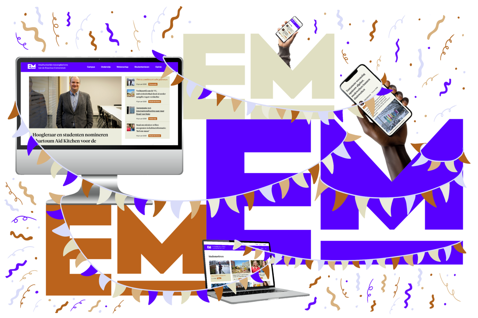
Image by: Sonja Schravesande
The new Erasmus Magazine (EM) site is now available for everyone to see. “And we are very happy about that”, says editor-in-chief Wieneke Gunneweg. “It was a lot of hard work, but I am proud of our new site, proud that it has become more accessible to everyone. Having an attractive website is great for us – we look at it every day – and for our readers. I hope they will read our stories with renewed enthusiasm.”
The EM site was due for a technical update. “We seized that moment to work on our corporate identity and appearance. With the use of our new colours, we make a distinguish between facts and opinion: the orange-brown stands for news and background, and purple for opinion, such as columns and letters to the editor. We also take more space to clearly explain what EM is and what we stand for.” At the top of the site, we emphasise that EM is the independent news platform of Erasmus University, while at the bottom of the site we show our core values and links to, for example, the editorial charter and our journalistic code.
New look
The previous corporate identity dates back to the time when Erasmus Magazine was also published in print. EM has been solely online since 2018. Graphic design agency Unit20 was commissioned to develop the new style. “What struck us during our research was that higher education media sites use a lot of colour”, says Maud van Velthoven of Unit20. “Other news platforms often use a lot of white and one signal colour, usually red. We wanted EM to be somewhere in between.” That still means a lot of colour, but in keeping with EM‘s values: newsworthy, independent and reliable.
The main colour is purple-blue. “We still wanted a clear signal colour”, says Van Velthoven. “It combines the red of urgency and the blue that stands for reliability, and the contemporary feel stands out because it’s not a standard colour for news.” Colours are often a matter of sentiment, Van Velthoven acknowledges. “Mint green, for example, quickly feels commercial because we know it from Douglas. The earthy colours orange-brown and beige used alongside the purple-blue feel down to earth, profound, careful and stable.”
Een lijst met artikelen
-
Why EM is focusing on these six themes this year
Gepubliceerd op:-
Editorial
-
Accessibility
Rotterdam-based Level Level built EM‘s website and specialises in online accessibility. Andrée Lange, lead designer, explains: “Everyone experiences limitations at some point, whether it’s a cognitive impairment or a broken arm. You want everyone to be able to use your website. That also applies to colour contrast when you’re looking at your phone outside in the sun, for example.”
EM‘s revamped website has AA status according to the Web Content Accessibility Guidelines (WCAG), an international guideline for online accessibility. “It’s a boring and big instruction manual that specifies exactly what you need to take into account as a web developer. The correct colour contrast, for example, is one of those guidelines”, says Lange. “Where many sites go wrong – but not the new EM site – is that the HTML code is incorrectly structured for screen readers that read website text aloud for people with visual impairments. If this is not done properly, people can get stuck on a site. They cannot simply click away a pop-up. We put more information in the code to make this work properly. For example: at EM, you will see ‘read more’ next to related articles, which makes sense to many people. Thanks to our codes, it also makes sense to people who use a screen reader.”
Part of the responsibility for improved accessibility lies with the editorial team, says editor-in-chief Gunneweg: “‘”For example, we are going to include alternative texts for photos. This is new for us, so if we can improve this, we would love to hear about it. Feedback is always welcome.”
More good things to come
The new website is only a starting point, says Gunneweg. “We will continue to develop ourselves in all kinds of areas. For example, we are also working on an app, which will make EM even more accessible, as the majority of our readers read EM on their mobile phones. We will be working on that. For now, we have a new, well-organised and eye-catching website with more space for visual stories and video productions.”
Questions, comments, tips about the revamped website or other matters? Please send them to editor-in-chief Wieneke Gunneweg.
De redactie
-
 Tessa Hofland
Editor
Comments
Comments are closed.
Read more in Campus
-
House of Representatives wants basic grant for university master after HBO
Gepubliceerd op:-
Money
-
Politics
-
-
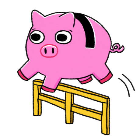
Company takes a huge chunk of the student finance of at least 350 internationals
Gepubliceerd op:-
Internationalisation
-
-
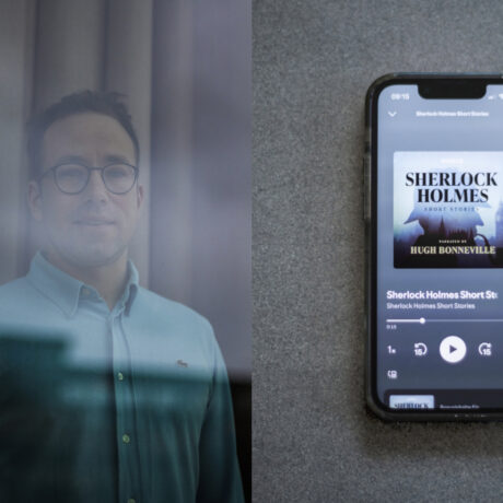
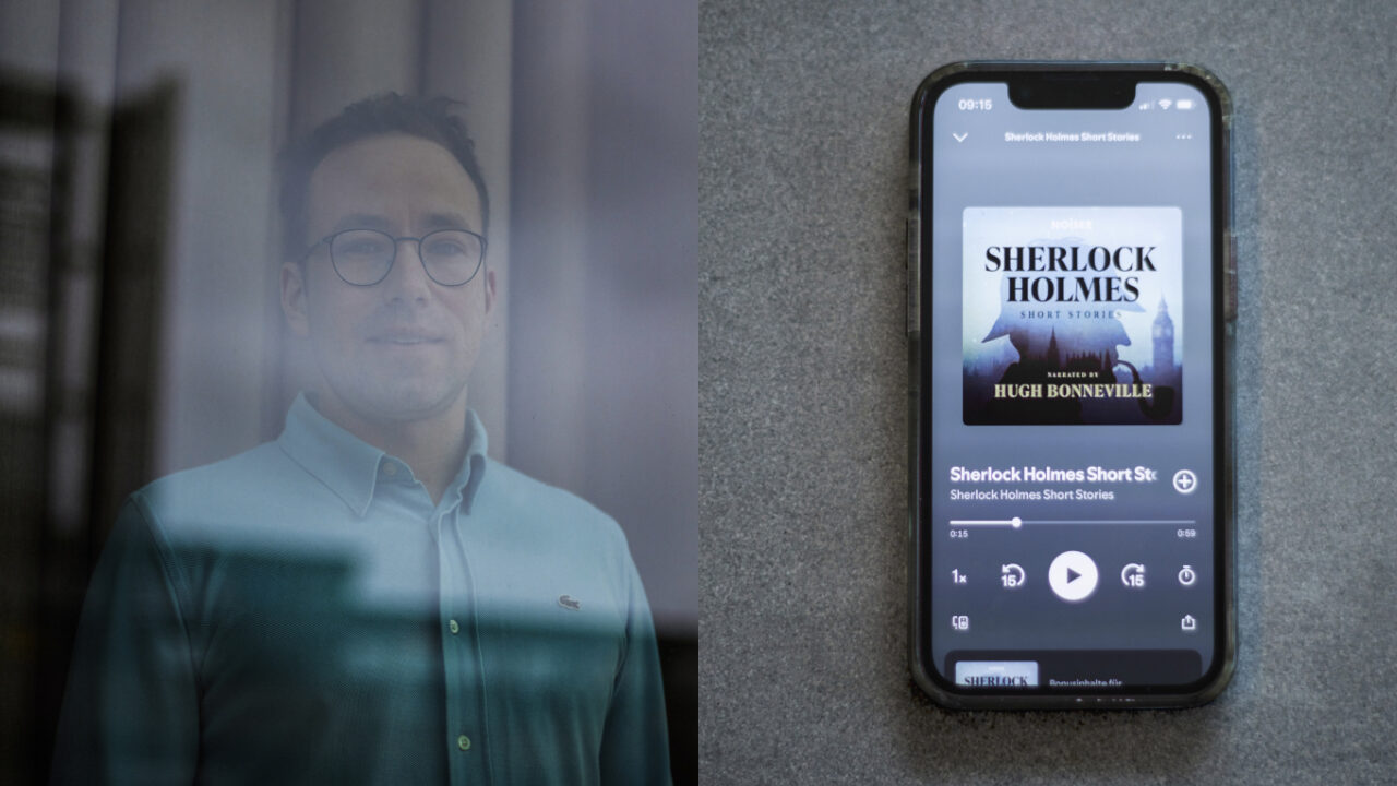
Why scientists are sometimes like Sherlock Holmes
Gepubliceerd op:-
Page-turners
-